The aim of this project was to monitor, in real-time using Plotly Dash, the evolution of the input/output cash flow of BeOptimized.
Three pages were created: The Planning & Billed/Unbilled page displays the planning (customers & working days) for the current month, as well as the invoices that still need to be paid for the current month.
The Invoice Details page shows a comparison between the current month and previous months. Lastly, the Yearly Evolution page is used to compare the current year with previous years.
The components of the application include: Excel for encoding inputs (the invoices of BeOptimized, including cash in/out, are recorded in Excel), SQLite for temporary data storage,
Dash Plotly for reporting, and Python/Pandas for data manipulation (inspired by
EFFECTIVE PANDAS by Matt Harrison —a book I highly recommend for mastering Python DataFrames!).
The project was divided into several parts:
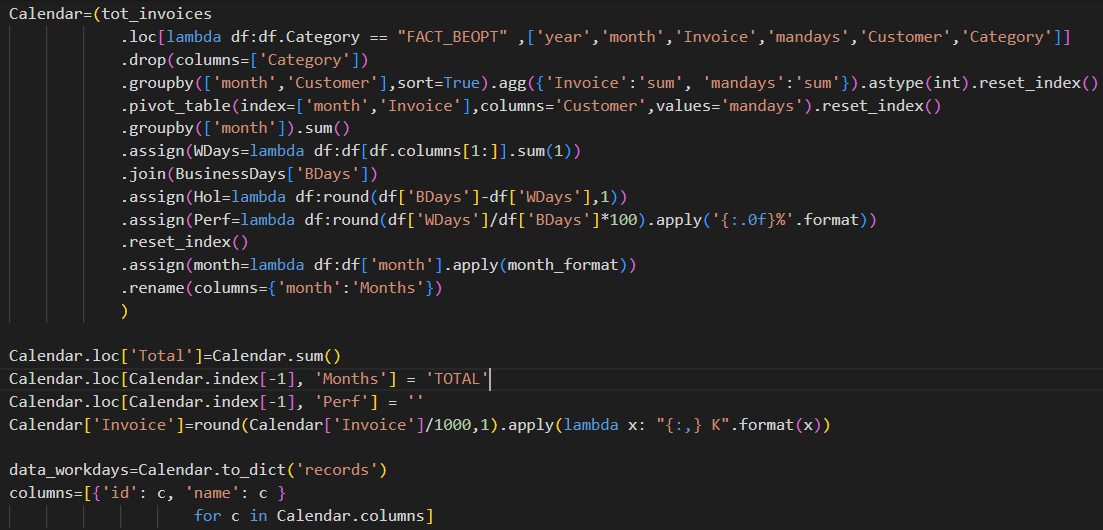
This dashboard page displays the main information to pilot the ongoing working month of BeOptimized:
List all the remaining invoices to pay, calculate the total invoices already paid (billed) and the total which still have to be paid (unbilled), number of working days, timesheet completion..
For the calendar, a bar chart was used: Each working day corresponds to 1 unit and holiday 1.5 units. The colors corresponds to the forecasted/observed billable days.
A treemap was also added to have an idea on the remaining invoices that still have to be paid this month (based on a combination of the observed and forecasted invoices).
In this video the inputs of the project are briefly described and couple of Python codes are presented.


This dashboard page is focused on the accountant years:
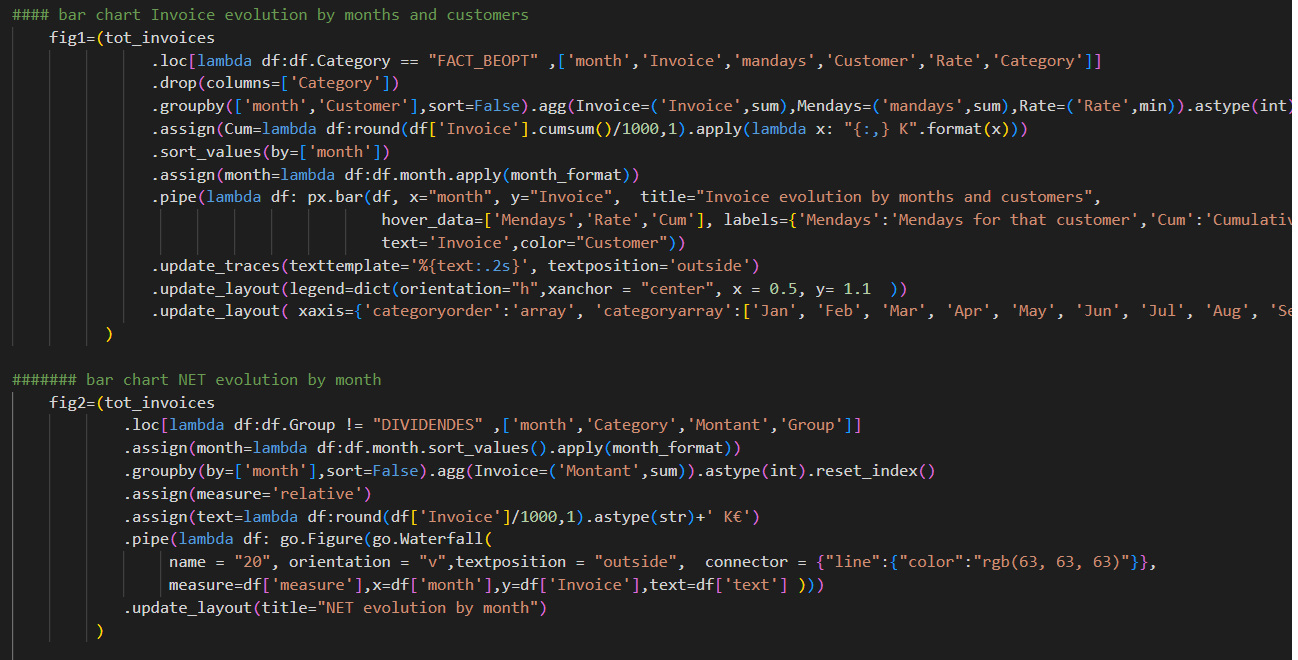
Total number of worked days per customer, total number of holidays, evolution of the cashflow month by month using stacked bar chart and waterfall graph...
Moreover the detail per category is also displayed in order to know their evolution accross the months.
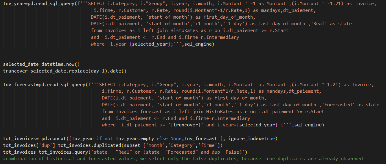
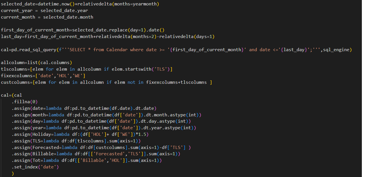
One more interesting thing is the forecast on the current month and rest of the year.
Here the current month is displayed with all the already paid invoices and invoices that we still have to pay for the rest of the month.
For each year a summary of all the main statistics is also displayed.
This video gives you more information on the page creation.
This dashboard displays the comparison between the different years:
Total invoices per quarter for all the years, rate comparison and finally a comparison of all the calculation per category accross all the years.
The rate comparison is a heatmap and the invoices is a stacked bar chart...
For the table, the average value is used in the right margin and the sum in the bottom margin.
The check boxes alows you to quickly select the years to compare.
This video gives you more information on the page creation.

By continuing to browse the site you are agreeing to our use of cookies. Review our cookies information for more details.